PSA: Please Stop Putting Your Brand Logo in the Bottom Right Corner
Yours sincerely, Ellie Reeves, Effectiveness Executive.
We’re all familiar with the fact that once you work in Out of Home, you can no longer enjoy being out of your home. Each bus shelter, tube car panel, and taxi wrap are a reminder of emails unsent and decks awaiting. For me, as someone who lives and breathes campaign effectiveness in their day job, the sight of each OOH ad renews a deep-seated rage, as I question why is every brand logo hidden in the bottom right corner?
What is an advert without a brand logo? Wasted space, wasted money, and fundamentally an ad for your competitors if consumers can’t attribute it to you. Over the 8 years we’ve run creative testing – 575 campaigns to be exact – Talon have produced one truly illuminating statistic: brand logos are only noticed by viewers 42% of the time.
Our creative testing relies on an online sample, who have nothing to do but stare at an image on a screen for five seconds. That means that even if we remove the chaos of the outside world, limit anything else that could be grabbing their attention, and put a creative right in front of them, less than half of the general public end up noticing the logo on a creative. When they do notice it, it takes 2.34 seconds for their eyeballs to actually hit the logo. Now that may work when we’re looking at commuters waiting a few minutes on a platform, but when roadside D6s see an average dwell time of 1.1 seconds, that 42% starts to look a lot smaller.
This doesn’t mean that media investment is pointless – far from it. But it does mean that we can sometimes forget the fundamental rules for creative effectiveness when designing for OOH. Learnings from our creative testing aren’t particularly sophisticated – they reflect essential guidelines for creativity to simplify and centralise. They’re common sensical, but also anecdotal, and when we can provide bespoke, quantitative data to our clients to show what’s not working, it’s much easier to fix. Giving clear advice on what needs to be altered, we’re able to optimise creatives pre-campaign or mid-flight to ensure the strongest impact for our clients.
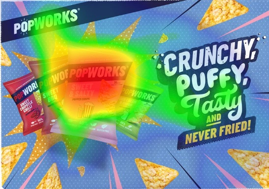
Rule one: keep it simple. The more features that are added to an ad, the more fragmented viewer’s attention is, and the less likely people are to notice a logo. We see that when creatives include 3 key features (i.e. a headline, image, logo), attention rates for logos are +15% stronger than creatives that include 4 key features.
Rule two: people look at the centre of a creative first. Portrait creatives see gaze go from centre, to top to bottom, while landscape inevitably see gaze shift centre, to left to right. Using common sense, we can therefore imagine that the lowest levels of attention are in the bottom right corner of any given creative. Thankfully, we also have the data to back it up. Alignment on the left means logos over index by about +3%, while placement on the right under indexes by -17%. When placed in the centre, brand logos over index by +33%.
Now some good news for FMCG brands, automotive brands, and anyone who can showcase their brand logo within a product image. Though typically placed in the centre of a creative, we see that even when product images are hidden to one side, brand logos integrated into the product see much higher levels of attention – +24% above average, in fact.
So, what does this all mean? For the sake of your ad spend (and my sanity), make sure your brand logo is placed where people will see it. When we work day in and day out on the same creatives, we can forget the bigger picture – and that’s that everything on the picture needs to be bigger.
Keep it simple, keep it central, keep it seen. And most importantly, prove that you’re doing that.
As marketers begin to adjust to a post-cookie world, we’re appreciating that measurement is important and should be done right – but it can’t just be done at the end. Pre-campaign testing allows us invaluable insight into what’s not working, so that we can optimise both creative and impact. For years, we’ve used Talon Canvas to inform and drive creative effectiveness in OOH – get in touch with the Talon Effectiveness Team if you want to find out how we can help you maximise attention in OOH.